StudentMove Barcelona
A multilingual student relocation platform designed to make moving to Barcelona easier. The website helps future international students find the right university, secure accommodation, get visa and legal guidance, handle local setup, and connect with a student community before arrival.
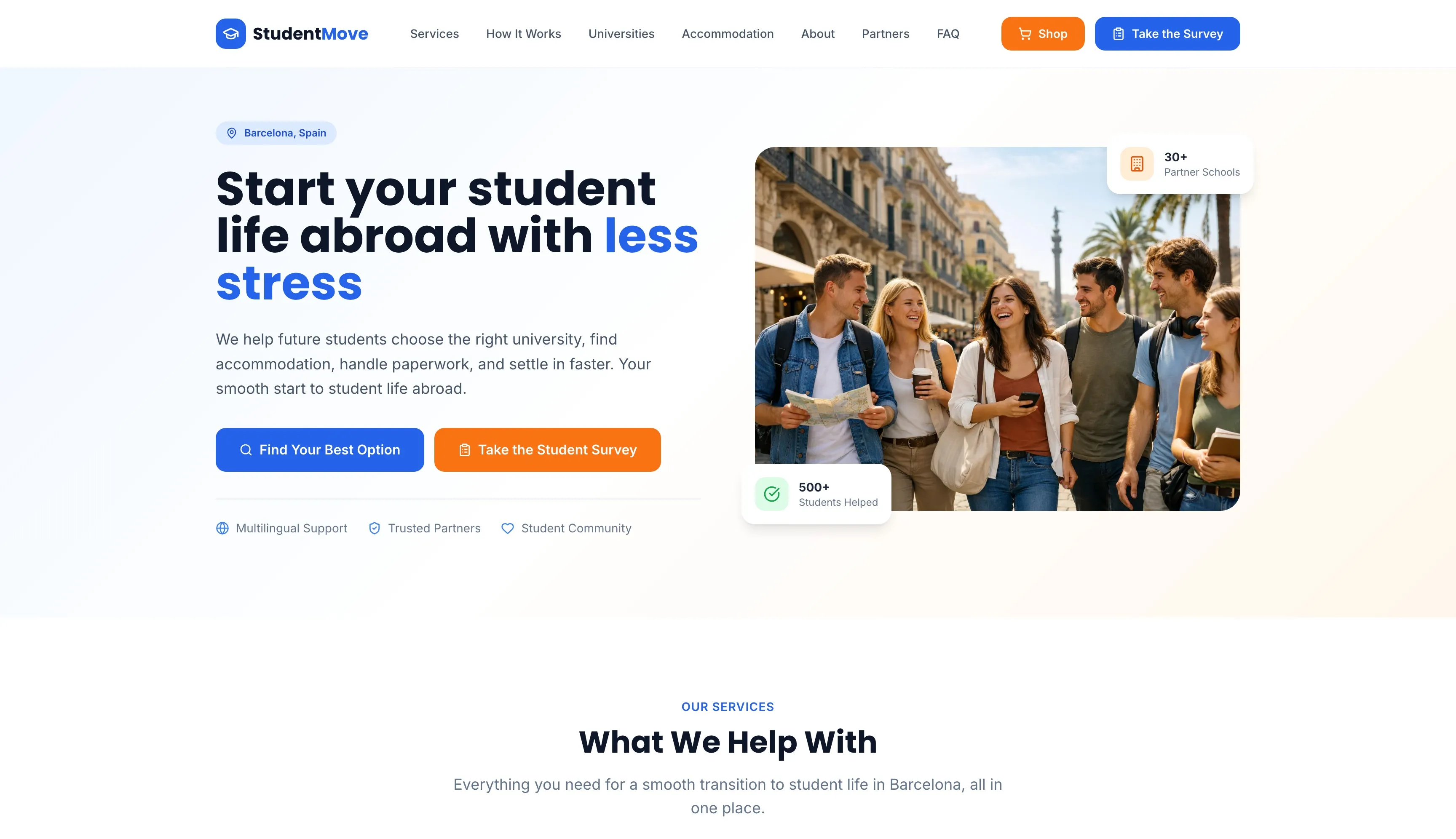
For StudentMove Barcelona, I did not want to build just another informational website with a few pages and generic student advice. I wanted to create something that feels like a real service platform from the first second. The core idea behind the project was to take a stressful, fragmented experience and turn it into a clear digital journey. Students moving to Barcelona usually have to figure out university options, accommodation, paperwork, visa requirements, and local setup all at once. Instead of treating these as separate problems, I decided to position the website around one central promise: making the transition to student life abroad feel easier, more guided, and more manageable. That decision shaped the whole structure of the site.
A big part of my approach was service clarity. Rather than overloading the user with too much text or too many choices at the start, I broke the offer into focused support areas like university matching, accommodation help, visa and legal guidance, local setup, and community access. This made the platform feel more useful and more trustworthy, because visitors can immediately understand what they are getting help with. I wanted the website to feel practical, not theoretical. That is also why I leaned into messaging that sounds supportive and direct instead of overly corporate or academic. The site had to speak to future students who are excited, but also nervous and overwhelmed.
I also made a strong UX decision to simplify the process into five visible steps: survey, matching, support, arrival, and community. That structure was intentional. A platform like this only works if the user quickly understands how the service actually helps them. By turning the experience into a step-by-step flow, I made the website easier to scan, easier to trust, and more conversion-oriented. Instead of feeling like a collection of pages, the project feels like a guided path. This was important to me because the concept itself is built around reducing uncertainty, and the user experience needed to reflect that.
Another key decision was to give the platform both a B2C and B2B dimension. On one side, the site supports students directly. On the other, it presents StudentMove as a partner platform for universities, residences, landlords, banks, insurers, transport providers, gyms, and legal services. I liked that because it gives the project more depth from a business perspective. It is not only a helpful student brand, it also works as a lead generation and partnership platform with real commercial potential.
From a monetization and trust perspective, I chose to build a clear one-time package model instead of making the offer feel vague. The site presents three plans, Essentials, Premium, and All-In-One, each with a defined scope and price, plus a 14-day money-back guarantee. I also integrated a secure Stripe checkout and structured the payment flow around familiar methods including major credit and debit cards, Apple Pay, and Google Pay. That decision helped the platform feel more complete and more legitimate, because users can understand the offer and purchase support directly without friction.
Overall, this project showcases how I like to work: start with the real user problem, build a clear service structure around it, create a smoother path to action, and make the final website feel purposeful from both a UX and business perspective. StudentMove was not just about making something look good. It was about designing a digital experience that makes a complicated life step feel simpler, more trustworthy, and easier to act on.
Like What You See?
Let's create something amazing together. Get in touch to discuss your project.
Get In Touch